Summary
In this post we are talking about prototyping and testing with people within the Rates Rebates Alpha. This post steps through the design prototyping approach to provide a practical understanding of what is involved, noting that all work is based on extensive user research already conducted around the challenge of rates rebates. The prototyping gave us a chance to test several quite different approaches to the rebate to find what worked best for people.
Rates rebates are a subsidy that gives a discount on the rates bill of a residential property for low to medium income households. It is a real pain point for users, Council and Central Government and so a good entitlement to make more proactive and easy for people to access.
Getting started with prototypes
One of the hardest parts of any process can be getting started; being confronted with a blank page before starting a project. When beginning to design and test, we try to keep things simple. Mocking up a simple wireframe and testing with people will show what works for them. If a prototype is too refined, your testers might get hung up on details such as “I don’t like that colour, that picture or shape”.
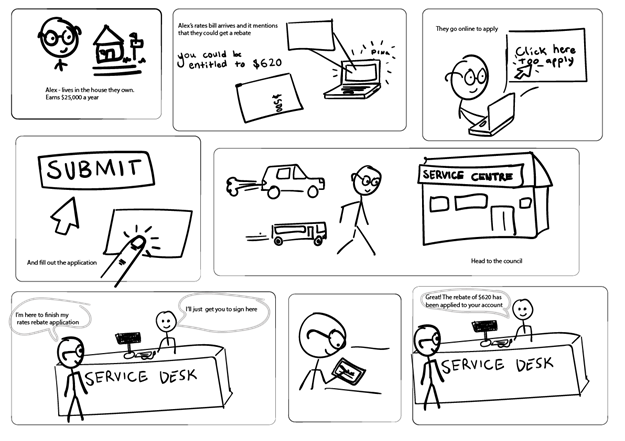
I often start with simple sketches on paper to help visualise what I’m working on.

Detailed description of illustration
First frame: A person wearing glasses standing beside a house with text “Alex lives in the house they own, earns $25,000 a year.
Second Frame: A computer getting an email and a paper letter. Text reads: Alex’s rates bill arrives and says he could get a rebate of up to $620.
Third frame: Alex using a laptop. Text reads: “they go online to apply”.
Fourth frame: Mouse hovering over a button that reads SUBMIT and finger clicking a touch pad. Text reads: “and fill out the application”
Fifth frame: Alex walking towards a “service centre” building, a car and bus are beside them. Text reads “Head to the council”.
Sixth frame: Alex standing at council service desk saying “I’m here to finish my rates rebate application”. Person behind the counter replies “I’ll just get you to sign here”. Seventh frame: Alex using a stylus to sign their name on a tablet.
Eighth and Last frame: Alex at service desk. Person behind the counter says “Great! The rebate of $620 has been applied to your account”
Starting the prototype build, I used Atomic - a fantastic, free, easy-to-use and Wellington made prototyping app. My first prototype is a simple monochrome version that asks one question per page leaving the customer feeling a bit “wait… how did I answer that last question?” So I mocked up an accordion style verison in colour with all the questions on one page.
Mobile first
In 2016, mobile internet traffic overtook desktop traffic. So any web experience should also work on mobile. Atomic has an iOS app for testing prototypes on mobile.
Next came a mobile-sized mock-up with the design based on an existing service, SmartStart, so users have a consistent experience and get where they want to go more quickly. This prototype is much more high fidelity, in colour, and with all the forms fields on one page. It includes a little house logo and text formatting. The landing page gives some information about what a Rates Rebate is and invites the user to apply.
User testing
I created a more sophisticated prototype, which we tested with Tauranga City Council Service Centre staff, Call Centre staff, and some Tauranga residents. This prototype includes te reo Māori for some headings, gives more information about what a rebate is and features a calculator to check eligibility before you apply. The apply page includes all the questions. Once the form is submitted the instructions for next steps pop up on the same page to allow the applicant to review their answers.
Feedback helped us hone the language, the question and content order etc. Testers didn’t have any issues with font, colours, buttons etc.
Insights
Our research told us people appliying for the rates rebate often don’t know how much they earn. As many are on Superannuation or Work and Income benefits we can ask if they’re on one of these income sources, as the amounts are known.
We also found that there was some embarrassment about income and about asking for any form of help which was a barrier to applying, so we designed an anonymous calculation step at the beginning of the service so people don’t have to go through a full application before they find out if they are eligible to anything (which is the current process). We found users that had gone through days of effort to apply, only to discover they were entitled to 30 cents.
Positive feedback included “that was easier than I thought!” or “I didn’t know government things could be like this”.
Feedback included the consequences of moving a service online. People access government services in different ways so going digital involves thinking about how they interact with services – it’s not just moving forms from paper to online.
We’re testing a pilot service (Alpha) based on this prototype in the coming months in Tauranga for the current rating year. Should the Alpha go well, we are ready for a broader use in August, when most rebate applications come in. While I’ve been working on prototypes and user testing, our Lab developers have been writing the Alpha code as open source on GitHub - check out their progress here:
Front end: https://github.com/ServiceInnovationLab/pancake-frontend
Back end: https://github.com/ServiceInnovationLab/pancake-backend
We will continue to post regular updates as it progresses.
To know more, provide feedback or put in ‘pull’ requests on the GitHub, please feel free to get in touch with siobhan.mccarthy@dia.govt.nz
You can also read our previous posts on our Rate Rebate work.
If you'd like to stay across our work as it progresses, please join our mailing list.


