A project to redesign the government domain name service (DNS) content on Digital.govt.nz enabled the content team at the Department of Internal Affairs to take a user experience approach to help demystify the online information on this government service.
Government domain name service
The Department of Internal Affairs manages the allocation of .govt.nz and .parliament.nz domain names through the government domain name service. .health.nz and .mil.nz domain names are also included.
The service provides:
- a straightforward application process — for registering new domain names
- the domain name portal system — where government organisations can manage their domain names.
Why redesign?
Content from a stand-alone website (DNS.govt.nz) was migrated to Digital.govt.nz in 2018.
Recent changes to the service provided a good reason to refine the current content, so the information is clear and relevant, and incorporates new content.
View the redesigned section — government domain names
User experience (UX) process
We wanted to incorporate user experience principles into the content redesign so we used the following 4-phase process.
- Define key information.
- Research.
- Define the structure and draft the content.
- Get feedback.
1. Define key information
The first step was to meet with the government domain name service manager and product owner of Digital.govt.nz to define the:
- purpose of the information
- target audience
- key themes to cover.
This is a good way to get a shared understanding of the project goals.
We defined the following purpose and audience for the redesigned content.
- Purpose — to provide user-friendly information on the application process and services we provide.
- Audience — government employees who register and manage .govt.nz domains.
The key themes to cover were drafted at this stage and finalised after getting user feedback in the research phase.
The final themes were:
- find eligibility criteria
- get guidance on choosing a domain name
- learn about the application process and apply
- learn how to transfer domain names to the service
- access the domain name portal and find guidance on how to use it.
2. Research
The research phase included:
- desk research — review of the current content, reading a research report on the service
- meeting with the service support team
- 6 interviews.
The interviews provided the most value.
Interviewees were sourced from a list of the most recent applicants for a .govt.nz domain name.
We kept the interviews short (half an hour) which was enough time to get top-of-mind thoughts and impressions.
Understanding the key questions in people’s minds helps you prioritise which topics to cover and highlight them in your content.
The first questions we asked were:
- When you went through the application process, what information did you need?
- What were the top 3–5 things you needed to know?’
The people we interviewed told us they found the information they needed by asking colleagues and contacting the service directly, not by viewing the content on Digital.govt.nz. This prompted us to re-evaluate the focus of our work.
If people aren’t using the web content to find information on the application process, we need to redesign it to be a more useful tool for the service to direct people to.
Then over time we will gain credibility for having content that’s clear and relevant for our audiences.
3. Define the structure and draft the content
Taking the time to define key information for the project and research user needs means that you’re in a much better place when you start to define the structure and draft the content.
The people we interviewed told us that the following information was important to them.
- Eligibility.
- How to choose a domain name.
- What is the application process.
- How to access the management system.
- Contact details.
So we made sure that this information was highlighted in the index page headings, navigation and other user interface features like buttons.
Desktop view
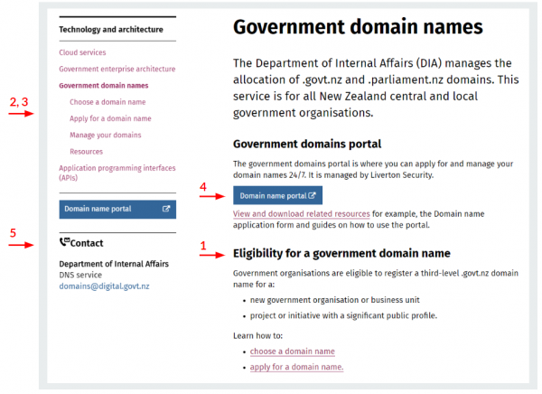
In figure 1, the numbered arrows show how we’ve highlighted the key information (in the numbered list) on the government domain names section index page.

Detailed description of figure 1
Screenshot of the desktop view of the government domain name index page with numbered arrows showing how key information (1. Eligibility, 2. How to choose a domain name, 3. What is the application process. 4. How to access the management system, 5. Contact details) has been highlighted to make it easier to find.
Mobile view
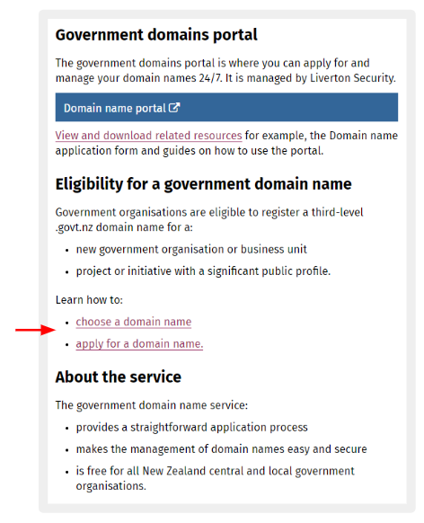
When you highlight key information in the left navigation menu, you also need to highlight it in the main body of the page. This is so people viewing the page on a small screen, where the navigation menu is hidden, can still access the information easily.
The arrow in the mobile view screenshot in figure 2 shows where 2 items in the navigation menu have been replicated in the main body of the page to ensure they are easy to access.

Detailed description of figure 2
Screenshot of the mobile view of the government domain name index page with an arrow showing where 2 items from the navigation menu (Choose a domain name and Apply for a domain name) have been replicated in the main body of the page to ensure they are easy to access.
Reduced number of pages
We reduced the number of pages from 15 (in the old section) to 5 by ‘chunking’ related content together and removing irrelevant content.
To help shorten the pages, we used accordions to create a list of linked headings that can be clicked to reveal or hide content underneath. People can use accordions to pick and choose what content to read.
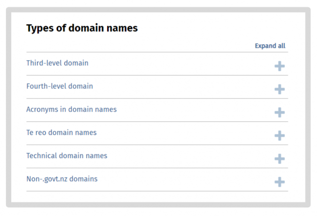
The accordion in the screenshot in figure 3 shows how we grouped related content together to make it easier for people to scan to find information that is relevant to them.

Detailed description of figure 3
Screenshot of an accordion that provides a list of linked headings to information on different types of domain names.
The items in the list are: third-level domain, fourth-level domain, acronyms in domain names, te reo domain names, technical domain names and non-govt.nz domains. Plus and minus signs are included to the right of each linked heading to indicate if there is content to be revealed or hidden.
The words ‘Expand all’ are provided above the list of linked headings so people can reveal the content underneath all the headings at the same time. This text changes to ‘Collapse all’ when clicked so people can click on it again to hide the content under all the headings.
Using these approaches means there’s less content for people to process, and less for content designers to maintain. It’s a win-win!
Process template
We’ve used a ‘process’ template to show that the application process is straightforward and provide useful information in context.
The template presents numbers in an attractive way to catch the eye and provide some ‘design delight’. They are connected by dotted lines to highlight their relationship.
View the Apply for a domain name process page
GatherContent tool
GatherContent (a content development collaboration tool) enabled the project team to easily collaborate in the draft and review stages. Our subject matter expert (the government domain name service manager) was very responsive and the tool made it easy to incorporate their changes quickly and bounce questions back and forth.
4. Get feedback
The last phase in the process was to get feedback. The draft content was reviewed by another content designer and the subject matter expert. Then we sent it to our reference group, the people we interviewed in the research phase.
The feedback we got was positive. I believe this was because people appreciated that they’d been involved throughout the process and were fully engaged and aware of what we were trying to achieve.
The layout is great, step by step works well and it’s full of enough information about what users need to do, plus it demystifies the portal process.
I was very happy to see the word ‘demystifies’ used in the feedback! I believe it is the content designer’s role to demystify information on government services.
If we can work to make government digital content clear and relevant, by taking a user experience approach, then we can make it easier for people in the community to understand how the government can support them.
Measurement
It’s also important to gather feedback over the longer term. The audience for this content is small and so we do not expect to see a big increase in visitors.
When the audience is small and distinct it's more useful to measure success with qualitative measures so we will be monitoring the:
- user inquiries to the service desk — to see if they are more informed
- time spent resolving issues by service users and support staff — to see if the time decreases because the content is seen as an authoritative source of advice to refer and link to.
The new section was published in December 2019 and so far the website statistics have shown that the average number of pages viewed per session was at least 80% of the total (4 out of 5). Compare this with 40% (6 out of 15) for the old section. This tells us that the majority of the people visiting the section are viewing all the key information we’ve presented.
Contacts
For more information on the government domain name service, contact domains@digital.govt.nz.
For more information on taking a user experience approach to content design, contact Louise.Lum@dia.govt.nz.


